Analyzing Calendar Apps
Background
This project was a course component of the Human-Computer Interaction course at Dalhousie University. I was part of the RED team which consisted of 5 researchers in total. We shared the workload equally amongst us and, all of us constantly swapped responsibilities to gain experience with various skills.
A Plethora of calendar apps are out there in the market but only a few calendar apps are used by the majority of the population. We were on a mission to design our own calendar app after performing background research on the existing calendar apps in the app store. We selected two popular calendar apps - Any.do and Google Calendar. Since both of these had a huge number of downloads and better ratings in both Google Playstore and App Store.
Study Design
- Initially, we wanted to understand the usage of calendar applications to uncover the design issues with both Any.do and Google calendar. So we conducted usability tests with both the apps. This was a within-study design and to avoid bias, we randomized the order in which the apps were used among users.
- The First, we came up with a list of tasks that the user had to perform with both the apps. When the users were performing the tasks, one of the researcher noted down the observations. Second, we designed a survey to collect user feedback regarding the usability of the app.
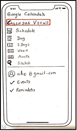
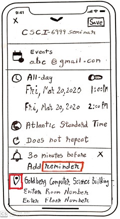
- Third, we interviewed the participants and gathered their feedback for analysis. This served as our background research for our initial app design. We then created paper prototype of our app that we envisioned. This was closer to improving the design of google calendar. Due to the COVID-19 pandemic, the university shut down and unfortunately our team size dwindled. Hence, we redesigned google calendar according to the results from the analysis.
Analysis
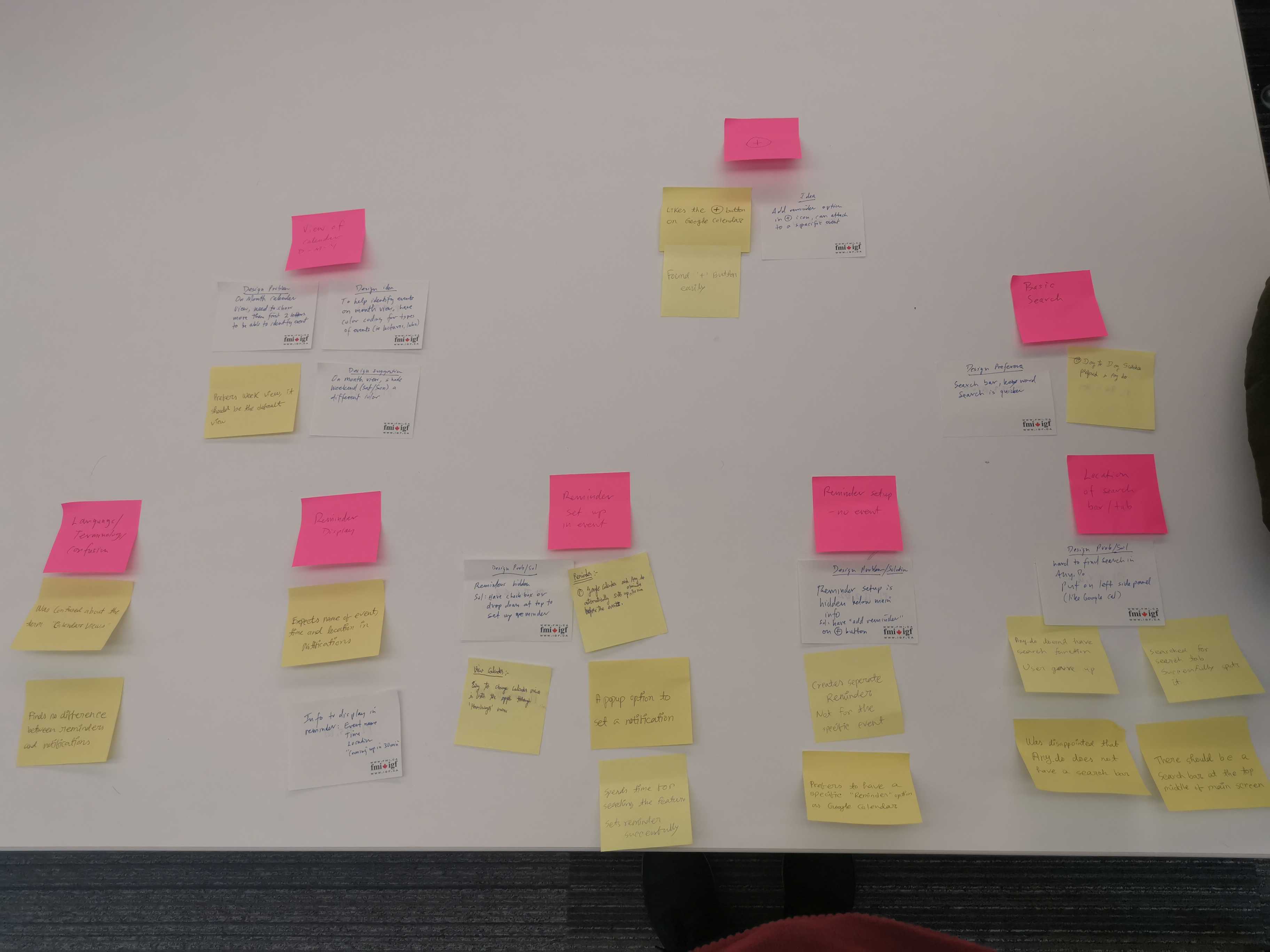
We used descriptive and inferential statistics to analyze the survey data and respresent our results using bar charts. For analyzing the qualitative data (observations noted by the researchers and user feedback from the interview), we used an affinity diagram to draw themes from the feedback. The Themes that lead to the design changes were Language/Terminology confusion, Feature Suggestion, Calendar View, Reminder Setup.
Results
- From the descriptive and inferential analysis, it was evident that the users preferred Google Calendar over Any.do for various reasons. Users' found Google Calendar 50% more efficient than Any.do despite the process of the common tasks being similar across both the apps.
- The major issue with Any.do was that it did not have a search bar. When we asked users to lookup for events that they had created, they naturally started looking for a search bar in the app. In Any.do, they had to painstakingly go to the specific date to lookup for the event.
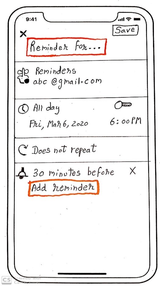
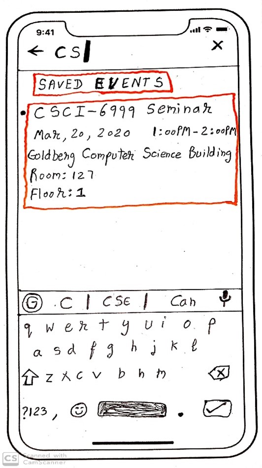
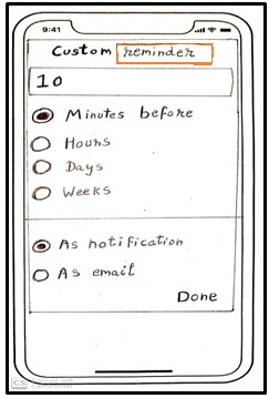
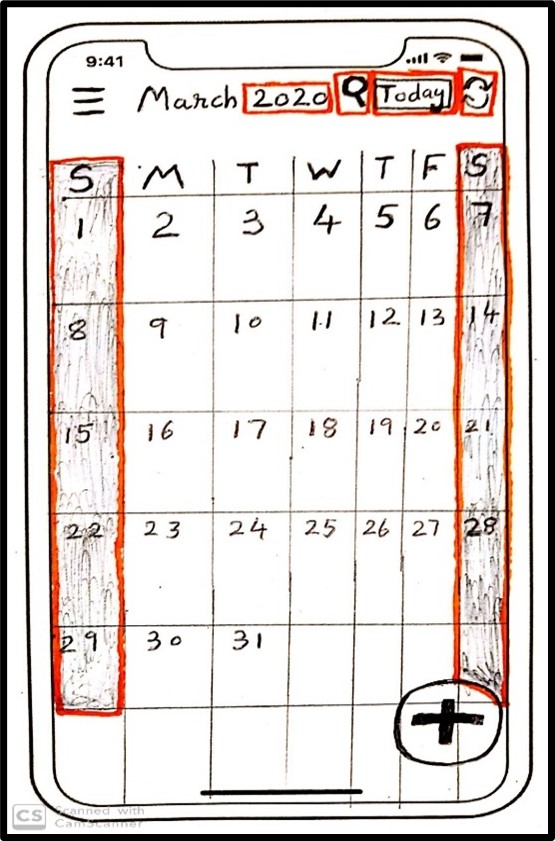
- The design changes that we did according to themes and user-feedback were as follows: We added a Search bar, differentiated between Reminder & Notification with appropriate labels. We added the ability to add room numbers for events, Display year in month view. We added a Week view and a 3-day view for the calendar view. Users wanted Shaded Weekends and Holidays for ease of identification.