Foody-Buddy
Background
- When it comes to choosing food, making a healthy meal choice is often tough with pictures of junk food and sugary confections all around the menu. One would not remember to choose a healthy meal when they see tasty food in front of them. People generally eat what they ate in childhood, and it might not be nutritious in the long run. After conducting a literature review, we found that a growing number of apps are trying to educate people about nutrition but most nutrition apps focus on weight loss and calories.

Research Goal
If nutrition apps are intended to create sustained behavioural change, they must help users develop a healthy relationship with nutrition and food. Our team consisting of 2 members, designed the game - "Foody-Buddy: Steps to Health". This persuasive gamified restaurant app aims to motivate the users to make a healthy meal choice while buying food at a restaurant.
App Design & Development
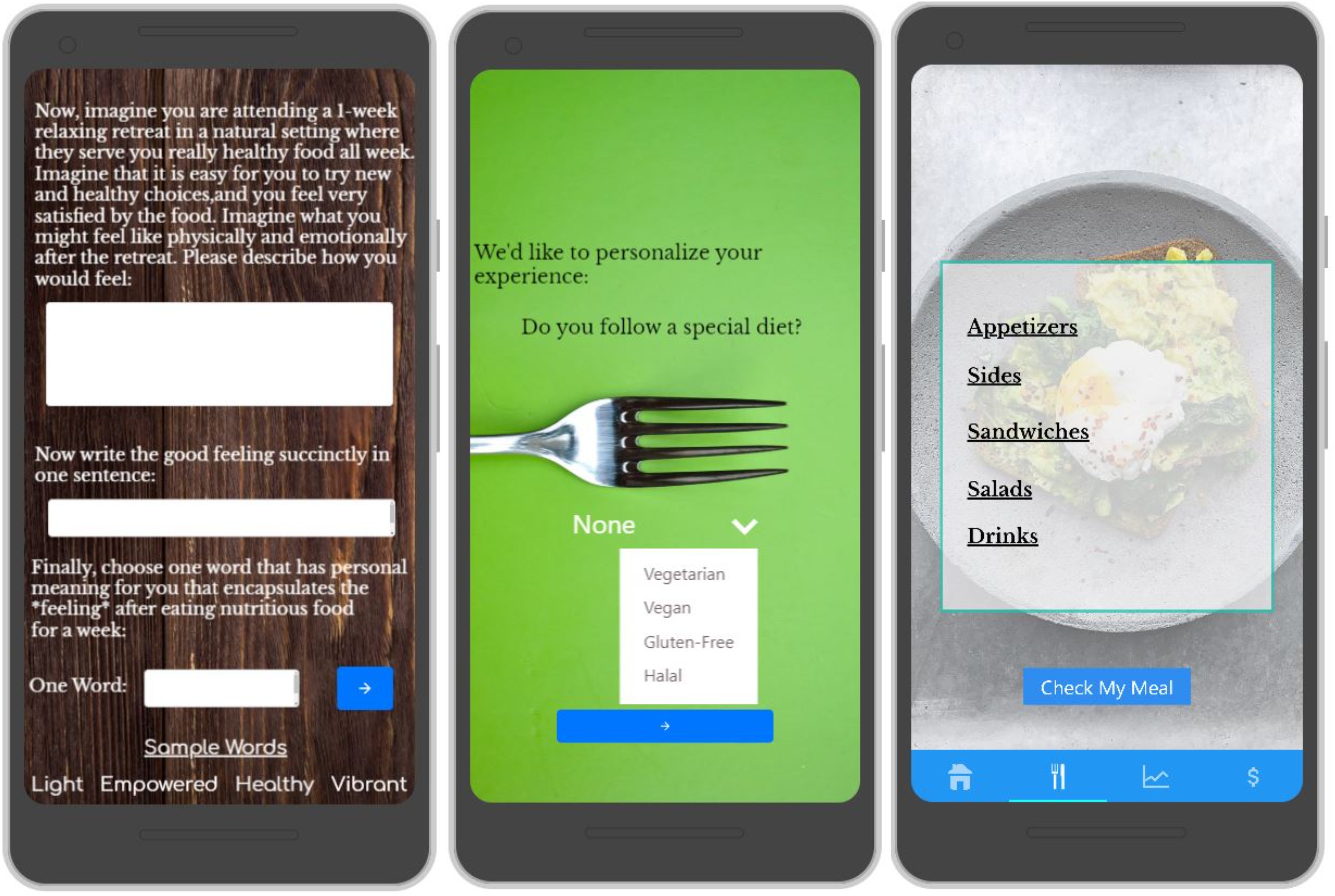
- Game Design - We designed the game according to the Persuasive Systems Design Framework. The two main features of our app were personalization and simulation of the effect of making a food choice. For personalization, we elicit the user's emotions by asking them to imagine a time when they had a healthy meal and felt good. We ask them to describe this experience in one word. We then ask them about a time when they had an unhealthy meal and felt sick. We ask them to describe their experience in one word.
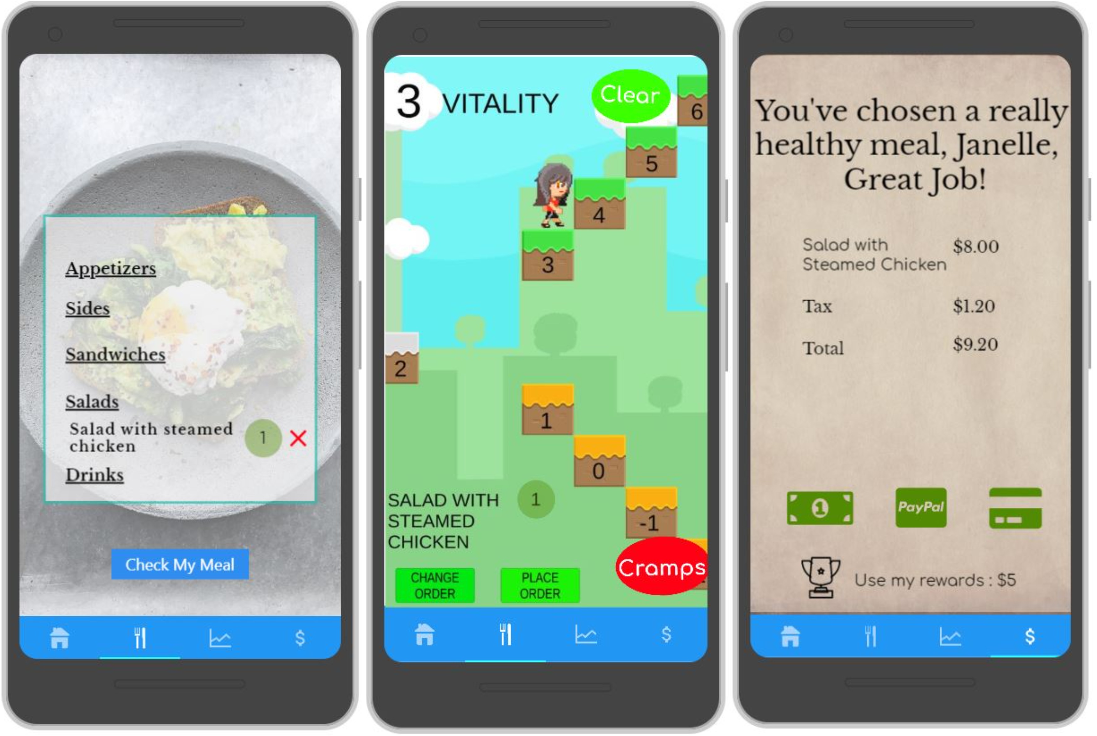
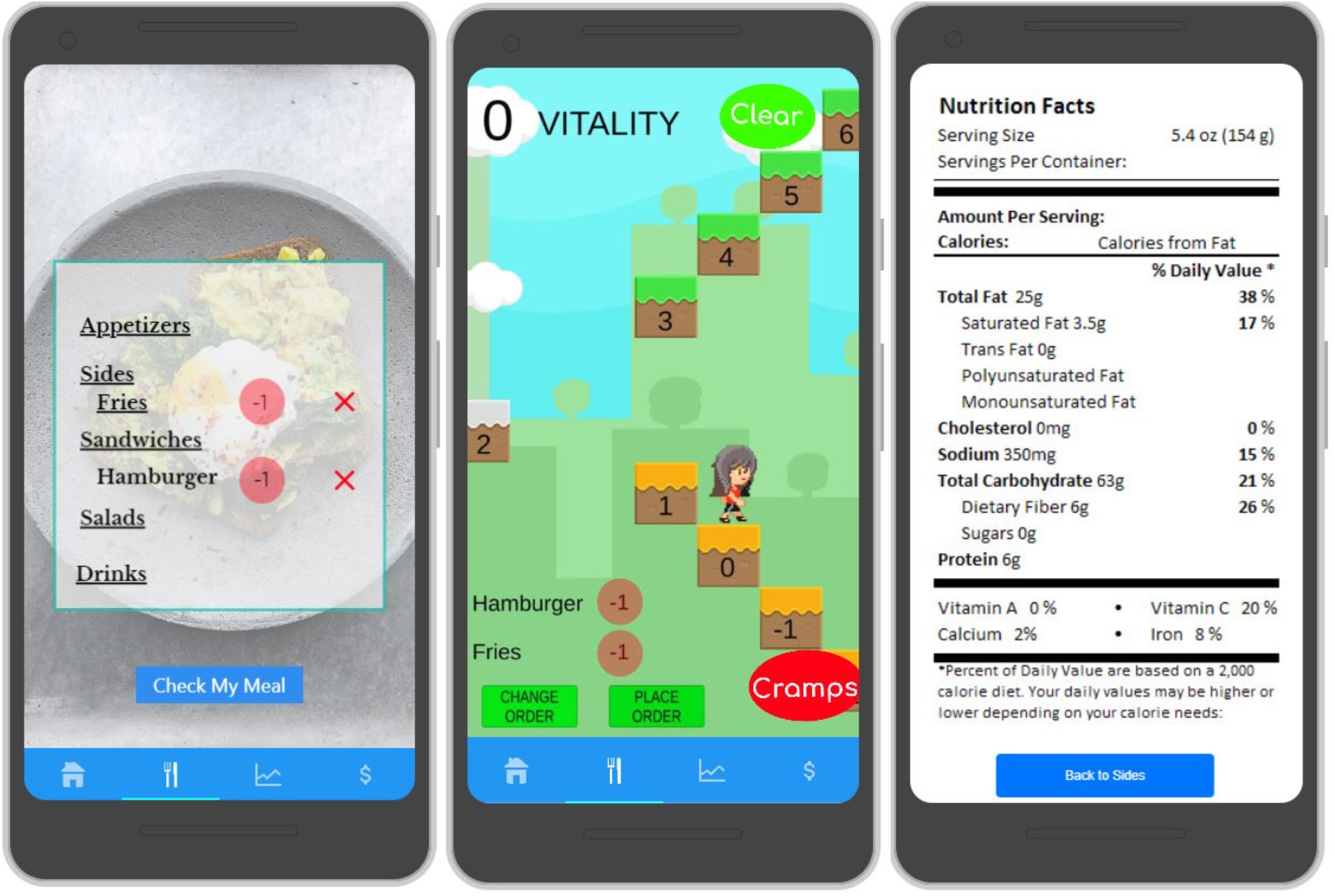
- We then display the restaurant menu to the user. We included a reward system to motivate the users. Junk food gives negative points and, healthy food gives positive points to the user. Users would earn points for ordering healthy food which, they can redeem for free food. In our initial design, we had a smiley beside healthy food and a frowning face beside junk food.
- When the user places an order, they are navigated to the game screen where the game character would be standing on a platform and would have two staircases leading up and down towards the positive and the negative words that they chose at the beginning. The game character moves up or down according to the points earned by the user based on their meal choice.

Prototypes
I drew the initial prototypes on a notebook and, later, I sketched them using Inkscape. This served as the low fidelity prototype for Study-1. I developed a high-fidelity prototype using Proto.io and Unity Game Engine and evaluated them as part of Study-2. The Persuasive strategies were gamified from the PSD Model put forth by Oinas Kukkonen et al. to motivate the users.
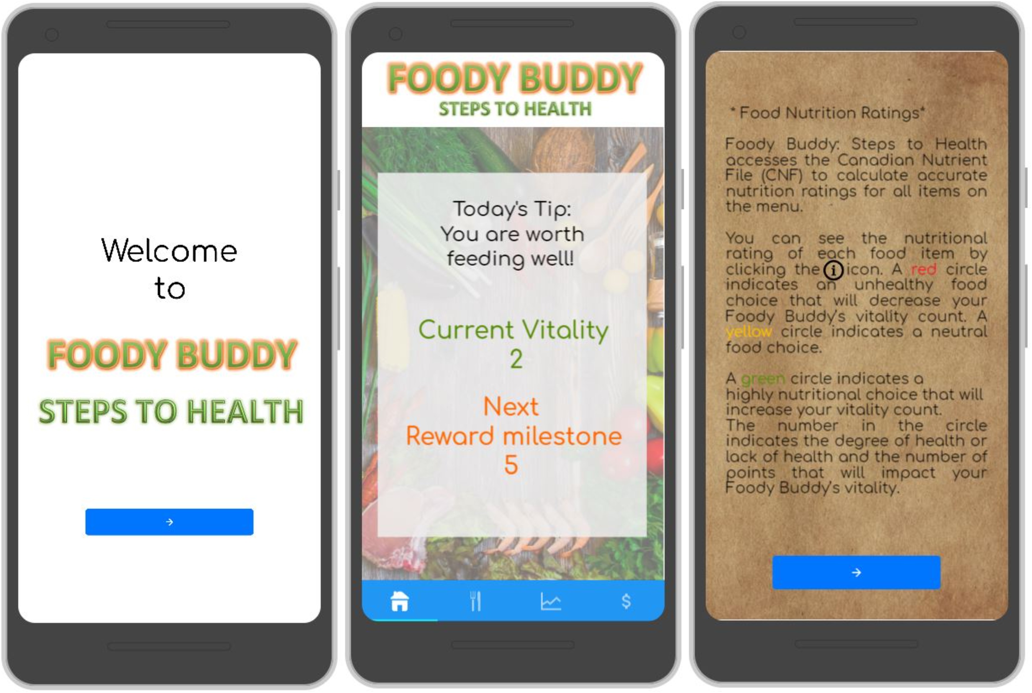
Foody-Buddy: PROTOTYPE
Study Design & Evaluation
- Study Design:1 - We conducted a user study (Study-1) with the Low Fidelity prototype in a Wizard-of-Oz style. After the pre-study questionnaire, one of the researchers interviewed the participant while the other researcher made changes to the prototype and noted down the user's behaviour and actions performed by them.
- Analysis:1 - We used an affinity diagram (thematic analysis) to extract themes from the Study-1 interview responses. We used a miro board for the affinity diagram due to the Covid-19 pandemic. With the insights from the thematic analysis, we designed the high-fidelity prototype. While designing the high fidelity prototype, we touched upon these Five areas: App Setup Process, Home Screen, Game Screen, Menu Interface and Payment Screen.
- Study Design:2 - As part of Study-2, the users tried out the interactive prototype and, their feedback was collected using an online survey. We chose the online survey methodology due to the COVID-19 pandemic. We included the perceived persuasive scale in our survey to measure the perceived persuasiveness of each game feature. We also had open-ended questions for collecting user feedback.
- Analysis:2 - From the descriptive statistics of Study-2, it was evident that the users liked to use our app in a real restaurant scenario. Nearly 84% of the users rated the personalization feature and the rewards feature as "very effective". Few users were surprised to see the personalization of their choices without notifying them. One user suggested adding a chatbot instead of open-ended questions for personalizing the app.
- The simulation feature was rated as "very effective" by 67% of the users. All of the persuasive features score above a neutral score of 3 on the Likert scale and, most of them scored above 4.
FOODY-BUDDY: GALLERY
UP NEXT
Analyzing Calendar Apps


